Basemap utility functions
addcyclic
Adds a longitude value, and a columns of values to the data array. Useful to fill the missing data when the data covers the whole longitudes.
mpl_toolkits.basemap.addcyclic(arrin, lonsin)
Note that it’s not a basemap method, but a separate function
arrin is the input data. A column will be added to fill the gap between the -180 and 180 longitudes
lonsin is a single dimension array containing the longitudes
from mpl_toolkits.basemap import Basemap
from mpl_toolkits.basemap import addcyclic
import matplotlib.pyplot as plt
import numpy as np

map = Basemap(projection='sinu',
              lat_0=0, lon_0=0)

lons = np.arange(30, 390, 30)
lats = np.arange(0, 100, 10)

data = np.indices((lats.shape[0], lons.shape[0]))
data = data[0] + data[1]

data , lons = addcyclic(data, lons)

lons, data = map.shiftdata(lons, datain = data, lon_0=0)

llons, llats = np.meshgrid(lons, lats)

x, y = map(llons, llats)

map.contourf(x, y, data)

map.drawcoastlines()
plt.show()
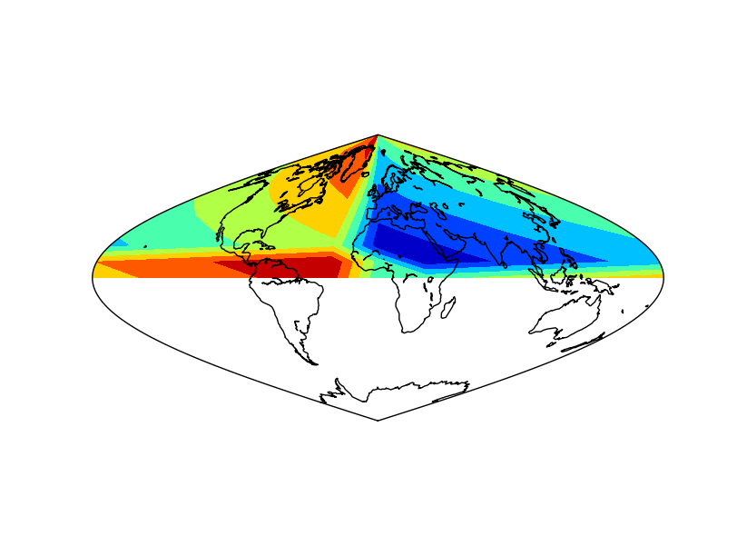
The example is the same as in shiftdata. The difference is that the white band disappears.
Note the order of the output variables: longitudes and data
Note that the longitudes are a one dimension array
colorbars
Draws the color legend at one of the edges of the map. The use is almost the same as in matplotlib colorbar
colorbar(mappable=None, location=”right”, size=”5%”, pad=”2%”, fig=None, ax=None, **kwargs)
mappable is the most important argument. Is the field on the map to be explained with the colorscale. It can be a contourf, a pcolormesh, contour, etc. If the value is None, the last drawn field is represented
location sets the border of the map where the color scale is drawn. Can be top, right, left or bottom
size sets the width of the color bar, in % of the parent axis
pad sets the separation between the axes and the color bar, also in % of the parent axis
fig is the figure the colorbar is associated with
Most of the matplotlib.colorbar arguments will work too, such as label
The colorbar method returns an object, which has some interesting methods too:
add_lines adds to the color bar, the lines from an other field (look at the example to see how does it work)
set_ticks changes the positions of the ticks and labels on the color bar
from mpl_toolkits.basemap import Basemap
import matplotlib.pyplot as plt
from osgeo import gdal
from numpy import linspace
from numpy import meshgrid

map = Basemap(projection='tmerc',
              lat_0=0, lon_0=3,
              llcrnrlon=1.819757266426611,
              llcrnrlat=41.583851612359275,
              urcrnrlon=1.841589961763497,
              urcrnrlat=41.598674173123)

ds = gdal.Open("../sample_files/dem.tiff")
data = ds.ReadAsArray()

x = linspace(0, map.urcrnrx, data.shape[1])
y = linspace(0, map.urcrnry, data.shape[0])

xx, yy = meshgrid(x, y)

cmap = plt.get_cmap('PiYG')

colormesh = map.pcolormesh(xx, yy, data, vmin = 500, vmax = 1300, cmap=cmap)
contour = map.contour(xx, yy, data, range(500, 1350, 50), colors = 'k', linestyles = 'solid')

map.colorbar(colormesh)
cb = map.colorbar(colormesh, location='bottom', label="contour lines")

cb.add_lines(contour)
cb.set_ticks([600, 760, 1030, 1210])

plt.show()
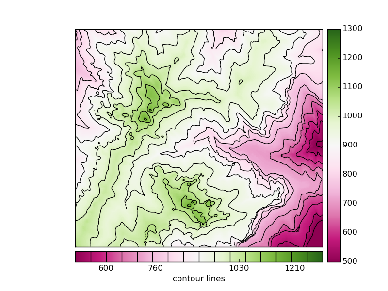
A colormesh and a contour fields are plotted, to be able to use some advanced colorbar attributes
The first colorbar (line 27), shows the default use of the colorbar. The pcolormesh is passed as the argument, to force the method to draw this one instead of the contour field
- The second colorbar uses some more arguments
The position is changed to bottom
A label is set
The method add_lines is used with the contour field, so the colorbar shows the pcolormesh and contour field legends at once
The ticks are set at random positions, to show how to change them
To see an example with logarithmic scales, take a look at the hexbin example
drawmapscale
Draws the scale of the map at the indicated position
lon and lat indicate the position of the scale on the map. The fact that the geographical coordinates must be used is a problem, since there’s no possibility to put the scale outside the map
lon0 lat0 indicate the location where the scale is calculated
length is the number of kilometers to represent in the scale
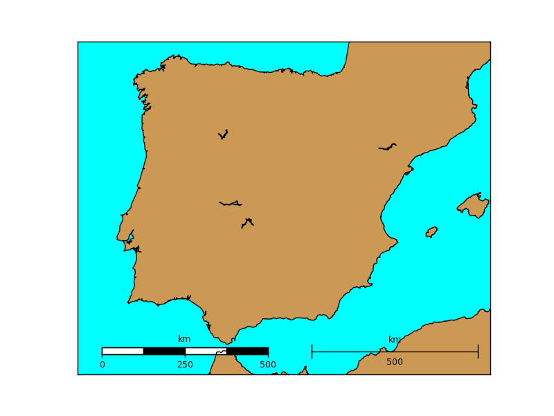
barstyle can be “simple” or “fancy”, and changes the scalebar style. Both styles are represented in the example
units indicates the units to represent in the scale, kilometers by default
fontsize changes the font size of the units drawn on the scale bar
fontcolor sets the font color of the units drawn on the scale bar
yoffset controls the height of the scalebar. By default is 0.02 times the height of the map. It doesn’t seem to work properly in all the versions
fillcolor1 and fillcolor2 set the colors of the bar at the scale bar when the style is “fancy”
format sets the number format on the scale bar
Note
The projection cyl (lat/lon), which is the default, can’t use this method. More informatino here.
from mpl_toolkits.basemap import Basemap
import matplotlib.pyplot as plt

map = Basemap(llcrnrlon=-10.5,llcrnrlat=35,urcrnrlon=4.,urcrnrlat=44.,
             resolution='i', projection='tmerc', lat_0 = 39.5, lon_0 = -3.25)

map.drawmapboundary(fill_color='aqua')
map.fillcontinents(color='#cc9955',lake_color='aqua')
map.drawcoastlines()

map.drawmapscale(-7., 35.8, -3.25, 39.5, 500, barstyle='fancy')

map.drawmapscale(-0., 35.8, -3.25, 39.5, 500, fontsize = 14)

plt.show()
gcpoints
Calculates n points along a great circle given two coordinates
gcpoints(lon1, lat1, lon2, lat2, npoints)
lon1 and lat1 are the geographical coordinates of the initial point
lon2 and lat2 are the geographical coordinates of the final point
npoints is the number of points to calculate
Note
To draw a great circle, the greatcircle function it may be easier to use. This function is useful to get the points values, or draw cases when greatcircle fails because of edges problems
from mpl_toolkits.basemap import Basemap
import matplotlib.pyplot as plt

map = Basemap(projection='merc',
              lat_0=0, lon_0=0,
              llcrnrlon=-20.,llcrnrlat=0.,urcrnrlon=180.,urcrnrlat=80.)

map.drawmapboundary(fill_color='aqua')
map.fillcontinents(color='coral',lake_color='aqua')
map.drawcoastlines()

x, y = map.gcpoints(2.3, 48.9, 139.7, 35.6, 300)

print x, y

map.plot(x, y)
plt.show()

greatcircle
A great circle is the maximum circle that can be drawn that passes through two points in a sphere (excepting when the points are the antipodes)
drawgreatcircle(lon1, lat1, lon2, lat2, del_s=100.0, **kwargs)
lon1 and lat1 are the longitude and latitude of the starting point
lon2 and lat2 are the longitude and latitude of the ending point
del_s is the number of kilometers that separate each point of the great circle. Defaults to 100
linewidth argument sets the width of the line
color sets the color of the line. This page explains all the color options
Note
If the circle gets cut by the edges of the map, i.e. starts at longitude -179 and ends at 179, the method can’t handle it properly
from mpl_toolkits.basemap import Basemap
import matplotlib.pyplot as plt

map = Basemap(projection='merc',
              lat_0=0, lon_0=0,
              llcrnrlon=-20.,llcrnrlat=0.,urcrnrlon=180.,urcrnrlat=80.)

map.drawmapboundary(fill_color='aqua')
map.fillcontinents(color='coral',lake_color='aqua')
map.drawcoastlines()

map.drawparallels(range(0, 90, 20))
map.drawmeridians(range(0, 180, 20))

#Paris-Tokyo
map.drawgreatcircle(2.3, 48.9, 139.7, 35.6,linewidth=2,color='r')
#Tokyo-Dubai
map.drawgreatcircle(139.7, 35.6, 55.2, 25.,linewidth=2,color='r')
#Dubai-Paris
map.drawgreatcircle(55.2, 25., 2.3, 48.9,linewidth=2,color='r')

plt.show()
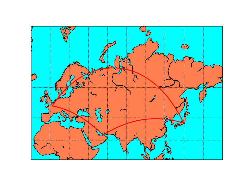
When using Mercator projection, the meridians and parallels are straight lines, but the great circles usually are not
from mpl_toolkits.basemap import Basemap
import matplotlib.pyplot as plt

map = Basemap(projection='gnom',
				width=15.e6,height=15.e6,
              lat_0=70, lon_0=80)

map.drawmapboundary(fill_color='aqua')
map.fillcontinents(color='coral',lake_color='aqua')
map.drawcoastlines()

map.drawparallels(range(0, 90, 20))
map.drawmeridians(range(0, 360, 20))

#Paris-Tokyo
map.drawgreatcircle(2.3, 48.9, 139.7, 35.6,linewidth=2,color='r')
#Tokyo-Dubai
map.drawgreatcircle(139.7, 35.6, 55.2, 25.,linewidth=2,color='r')
#Dubai-Paris
map.drawgreatcircle(55.2, 25., 2.3, 48.9,linewidth=2,color='r')

plt.show()
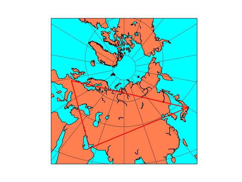
The gnomonic projection makes the great circles to be a straight line in any direction:
interp
Interpolates a grid to another grid, with different sizes.
Useful to create smoother plots or to have more elements when using barbs or quiver. Also useful when using maskoceans.
interp(datain, xin, yin, xout, yout, checkbounds=False, masked=False, order=1)
This function is not a method of the basemap instance, but a separate one in the basemap module
datain is the data array to interpolate. It has to be a 2d numpy array
- xin and yin are the coordinates of the input data array, in one dimension each.
This point is important, since implies that the input grid has to be regular (so no lon-lat grid in a different projection)
y has to be in increasing order
xout and yout are the coordinates of the output data array. They have to be 2d numpy arrays.
checkbounds if set to True, the xin and yin values are checked to be in the bounds of xout and yout. If False, and there are values outside the bounds, the output data array values will be clipped to the boundary values
masked makes the points outside the new grid to be masked if is set to True, or an arbitrary value if given
- order sets the interpolation method:
0 uses the nearest neighbor method
1 uses a bilinear interpolation
3 uses a cubic spline, and requires scipy.ndimage to be installed
from mpl_toolkits.basemap import Basemap
from mpl_toolkits.basemap import interp
import matplotlib.pyplot as plt
from osgeo import gdal
import numpy as np


map = Basemap(llcrnrlon=-82., llcrnrlat=28., urcrnrlon=-79., urcrnrlat=29.5,
              projection='lcc', lat_1=30., lat_2=60., lat_0=34.83158, lon_0=-98.,
              resolution='i')

ds = gdal.Open("../sample_files/wrf.tiff")
lons = ds.GetRasterBand(4).ReadAsArray()
lats = ds.GetRasterBand(5).ReadAsArray()
u10 = ds.GetRasterBand(1).ReadAsArray()
v10 = ds.GetRasterBand(2).ReadAsArray()

x, y = map(lons, lats)

x2 = np.linspace(x[0][0],x[0][-1],x.shape[1]*2)
y2 = np.linspace(y[0][0],y[-1][0],y.shape[0]*2)

x2, y2 = np.meshgrid(x2, y2)

u10_2 = interp(u10,  x[0], np.flipud(y[:, 0]), x2, np.flipud(y2),order=1)
v10_2 = interp(v10,  x[0], np.flipud(y[:, 0]), x2, np.flipud(y2),order=1)

map.drawmapboundary(fill_color='#9999FF')
map.fillcontinents(color='#cc9955', lake_color='#9999FF', zorder = 0)
map.drawcoastlines(color = '0.15')

map.barbs(x, y, u10, v10,
    pivot='middle', barbcolor='#555555')

map.barbs(x2, y2, u10_2, v10_2,
    pivot='middle', barbcolor='#FF3333')

plt.show()
The example is taken from the barbs method example, but zoomin in a lot so the number of barbs is too low, and gives a reason to interpolate
The positions of the wind barbs (x, y) are calculated using the basemap instance
- The new grid is created, using linspace
Since the grid is in the map projection, the x and y 2d array can be converted to a 1d array, since the values are the same for all the lines or columns
The new grid is created multiplying the number of elements by 2, with the same bounding values, using linspace
The new grid has to be in 2d arrays, which is done with the meshgrid method
- interp can be now called
Since x and y are two dimension arrays, only a single column is passed for x, and a single column for y
y axis is not in increasing order (coordinates gofrom north to south), so they have to be reversed using the numpy.flipud method. The output has to be reversed again to have the data properly ordered
Once the new grid is created, the barbs can be drawn in the new resolution
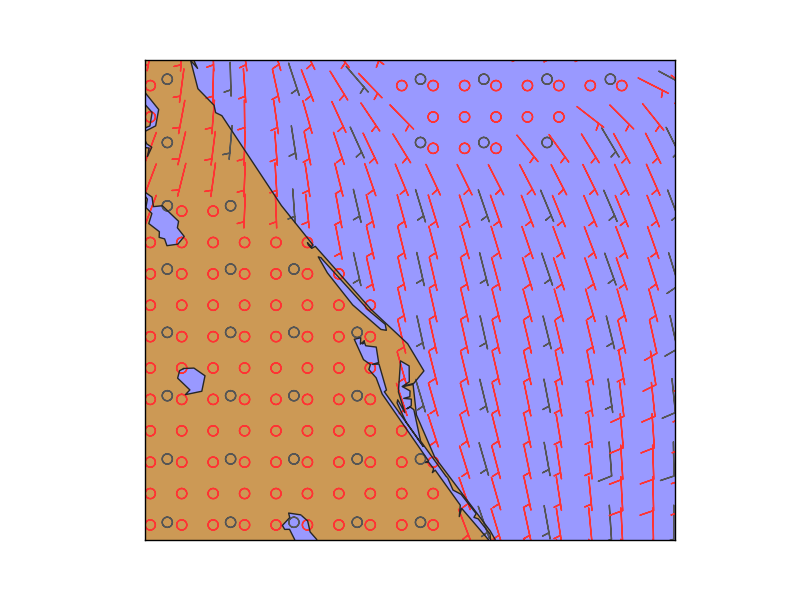
In gray, the original points, and in red, the interpolated ones
is_land
Returns True if the indicated point is on the land, and False if on an ocean or lake
- xpt and ypt are the point coordinates where the land/water has to be calculated.
The coordinates must be in the map coordinates
The resolution indicated in the Basemap constructor must not be None
The indicated resolution polygon will be used to calculated if the point is on a land zone, so the results change depending on that
No arrays of coordinates are allowed, so the query must be done point by point
There is an alternative way to calculate this for many points using the landpolygons attribute and the matplotlib PATH.contains_points method
from mpl_toolkits.basemap import Basemap
import matplotlib.pyplot as plt

map = Basemap(projection='aeqd', lon_0 = 10, lat_0 = 50, resolution='h')

x, y = map(0, 0)

print map.is_land(x, y)
The alternative way, which accepts multiple points and, in fact could be used with any polygon get from a shapefile (See Filling polygons)
#Idea taken from this post at StackOverflow: http://stackoverflow.com/questions/13796315/plot-only-on-continent-in-matplotlib/13811775#13811775
#I've re-written it to work with modern matplotlib versions

from mpl_toolkits.basemap import Basemap
import matplotlib.pyplot as plt
from matplotlib.path import Path
import numpy as np

map = Basemap(projection='aeqd', lon_0 = 10, lat_0 = 50, resolution='h')

lons = [0., 0., 16., 76.]
lats = [0., 41., 19., 51.]

x, y = map(lons, lats)
locations = np.c_[x, y]

polygons = [Path(p.boundary) for p in map.landpolygons]

result = np.zeros(len(locations), dtype=bool)

for polygon in polygons:
    result += np.array(polygon.contains_points(locations))

print result
locations is a numpy array containing numpy arrays with the projected points
The PATH objects are calculated for each of the polygons
For each PATH, all the points are evaluated using contains_points. The result is casted into a numpy array so can be added with the previous evaluations. If one of the polygons contains the point, the result element will be true
makegrid
makegrid method creates an arbitrary grid of equally spaced points in the map projection. Used to get the longitudes and latitudes that would form an an equally spaced grid using the map projection.
makegrid(nx, ny, returnxy=False)
nx and n define the size of the output grid
If returnxy is set to True, the positions of the grid in the map projection are also returned
returns the longitudes and latitudes 2D numpy arrays, and the x and y in the map coordinates arrays if returnxy is set to True
from mpl_toolkits.basemap import Basemap
import matplotlib.pyplot as plt
import numpy as np

fig=plt.figure(figsize=(9, 3))

map = Basemap(width=12000000,height=8000000,
            resolution='l',projection='stere',
            lat_ts=50,lat_0=50,lon_0=-107.)

lons, lats, x, y = map.makegrid(30, 30, returnxy=True)

ax = fig.add_subplot(121)
ax.set_title('The regular grid')
map.scatter(x, y, marker='o')
map.drawcoastlines()


ax = fig.add_subplot(122)
ax.set_title('Projection changed')

map = Basemap(width=12000000,height=9000000,projection='aeqd',
            lat_0=50.,lon_0=-105.)
x, y = map(lons, lats)
map.scatter(x, y, marker='o')
map.drawcoastlines()

plt.show()
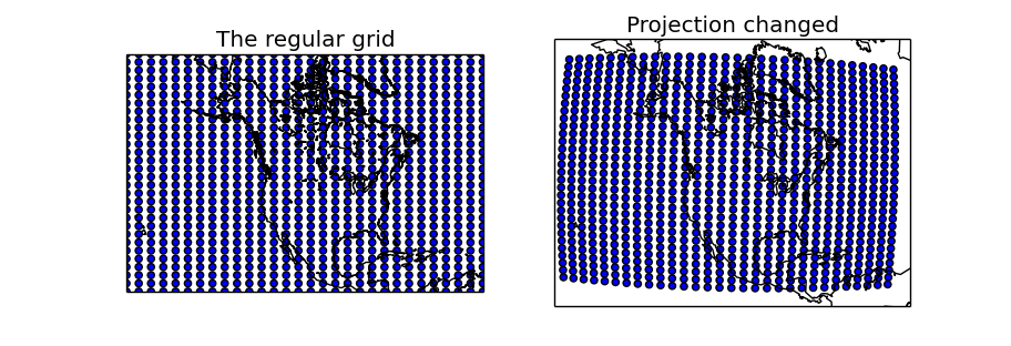
Two maps are created, one using the same projection as in the regular grid, and the other with another projection to show how to use the created longitudes and latitudes matrices
- makegrid is used with the returnxy set to True
The first map uses the x and y matrices directly, since is in the same projection. As expected, the created points form a regular grid of 30x30
The second map uses the lons and lats matrices, re-projecting them into the new projection using the basemap instance. The scatter shows that in the new projection, the grid is not regular
maskoceans
Takes a data array and masks the values at the points in the oceans and lakes
mpl_toolkits.basemap.maskoceans(lonsin, latsin, datain, inlands=True, resolution=”l”, grid=5)
This function is not a method of the basemap instance, but a separate one in the basemap module
lonsin and latsin are the location of the points in 2 dimensions arrays. Only latlon projections can be used with this method
datain is the array containing the values to mask with the oceans
inland sets if the lakes have to be masked too (true by default)
resolution selects the resolution of the land-sea boundaries to use then masking the arrays, “l” by default. The one defined by the basemap instance is not used
grid sets, in arch minutes, the resolution of the mask grid. 10, 5, 2.5 and 1.25 values are available
The output array has the same dimensions as the input data array
See the examples to understand the difference between the resolution and grid arguments
 1from mpl_toolkits.basemap import Basemap
 2from mpl_toolkits.basemap import maskoceans
 3from mpl_toolkits.basemap import interp
 4import matplotlib.pyplot as plt
 5from osgeo import gdal
 6import numpy as np
 7
 8
 9map = Basemap(llcrnrlon=-93.7, llcrnrlat=28., urcrnrlon=-66.1, urcrnrlat=39.5,
10              projection='lcc', lat_1=30., lat_2=60., lat_0=34.83158, lon_0=-98.,
11              resolution="h")
12
13ds = gdal.Open("../sample_files/wrf.tiff")
14lons = ds.GetRasterBand(4).ReadAsArray()
15lats = ds.GetRasterBand(5).ReadAsArray()
16data = ds.GetRasterBand(3).ReadAsArray()
17
18x, y = map(lons, lats)
19
20plt.figure(0)
21
22mdata = maskoceans(lons, lats, data)
23
24map.drawcoastlines(color = '0.15')
25map.contourf(x, y, mdata)
26
27plt.figure(1)
28
29x2 = np.linspace(x[0][0],x[0][-1],x.shape[1]*5)
30y2 = np.linspace(y[0][0],y[-1][0],y.shape[0]*5)
31
32x2, y2 = np.meshgrid(x2, y2)
33
34data2 = interp(data,  x[0], np.flipud(y[:, 0]), x2, np.flipud(y2),order=1)
35
36lons2, lats2 = map(x2, y2, inverse=True)
37mdata = maskoceans(lons2, lats2, data2, resolution = 'c', grid = 10, inlands=True)
38
39map.drawcoastlines(color = '0.15')
40map.contourf(x2, y2, mdata)
41
42plt.figure(2)
43
44mdata = maskoceans(lons2, lats2, data2, resolution = 'h', grid = 10, inlands=True)
45
46map.drawcoastlines(color = '0.15')
47map.contourf(x2, y2, mdata)
48
49plt.figure(3)
50
51mdata = maskoceans(lons2, lats2, data2, resolution = 'h', grid = 1.25, inlands=True)
52
53map.drawcoastlines(color = '0.15')
54map.contourf(x2, y2, mdata)
55
56plt.show()
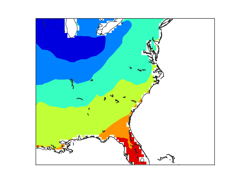
The first example (line 22), creates the mask directly. The result is coarse, due to the low resolution of the input data, not because of the maskoceans arguments

The second example creates a finer grid (lines 29 to 36) to avoid the effect of the big pixels due to the data. Look at the interp for details
The maskoceans function, however, is called with the lowest resolution in both grid and resolution arguments.
Note that the lakes at Florida are not masked, because the resolution is low, and that the Florida coast still shows the pixels, because of the big grid value.
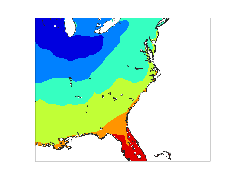
In this case, the resolution has been set to “h”, the maximum. The lakes are now masked, but the Florida coast still shows the pixel size used to create the mask.

Finally, when the grid is set at the finer resolution, the Florida coast smoothly matches the coast line.
nightshade
Draws the regions of the map which are dark at the specified date
nightshade(date, color=”k”, delta=0.25, alpha=0.5, ax=None, zorder=2)
date is a datetime.datetime object
color is the color of the drawn shadow
delta is the resolution to which the shadow zone is calculated. By default is 0.25, and small values fail easily
alpha is the transparency value
zorder can change the layer vertical position
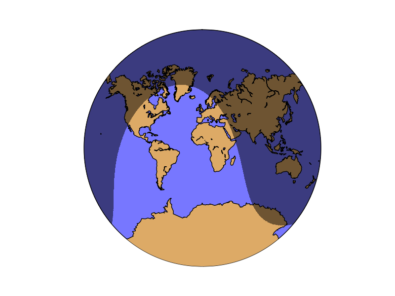
The example shows the current dark zones in the van der Grinten Projection:
from mpl_toolkits.basemap import Basemap
import matplotlib.pyplot as plt
from datetime import datetime

map = Basemap(projection='vandg',lon_0=0,resolution='c')

map.drawmapboundary(fill_color="#7777ff")
map.fillcontinents(color="#ddaa66",lake_color="#7777ff")

map.drawcoastlines()

map.nightshade(datetime.now(), delta=0.2)

plt.show()
rotate_vector
Given two matrices of the east-west and north-south components of a vectorial field, and the longitude and latitude of the points, rotates the vectors so they represent the direction properly on the map projection
Some functions, such as barbs, quiver or streamplot, that use vectorial data, asks the vector components to be in the map coordinates i.e. u is from left to right, v from up do down. If the available data is in geographical coordinates i.e. west-east and north-south, these coordinates have to be rotated or the vector direction won’t be plot properly. This is the aim of the rotate_vector method.
The method transform_scalar does the same function, but changing the grid size at the same time (interpolating the points)
rotate_vector(uin, vin, lons, lats, returnxy=False)
uin and vin are the input data matrices. The directions are the geographical, so the u component is west-east and the v component, north-south
lons, lats are 2D numpy arrays with the positions of the uin an vin matrices, in geographical coordinates
returnxy makes the method to return the lons and lats matrices reprojected to the map coordinates. Just as calling the basemap instance
from mpl_toolkits.basemap import Basemap
import matplotlib.pyplot as plt
import numpy as np


fig=plt.figure(figsize=(9, 3))


map = Basemap(projection='sinu',
              lat_0=0, lon_0=0)

lons = np.linspace(-180, 180, 10)
lats = np.linspace(-90, 90, 10)

lons, lats = np.meshgrid(lons, lats)

v10 = np.ones((lons.shape)) * 15
u10 = np.zeros((lons.shape))

u10_rot, v10_rot, x, y = map.rotate_vector(u10, v10, lons, lats, returnxy=True)

ax = fig.add_subplot(121)
ax.set_title('Without rotation')

map.drawmapboundary(fill_color='aqua')
map.fillcontinents(color='#cc9955', lake_color='aqua', zorder = 0)
map.drawcoastlines(color = '0.15')


map.barbs(x, y, u10, v10,
    pivot='middle', barbcolor='#333333')

ax = fig.add_subplot(122)
ax.set_title('Rotated vectors')

map.drawmapboundary(fill_color='9999FF')
map.fillcontinents(color='#ddaa66', lake_color='9999FF', zorder = 0)
map.drawcoastlines(color = '0.15')

map.barbs(x, y, u10_rot, v10_rot,
    pivot='middle', barbcolor='#ff7777')

plt.show()
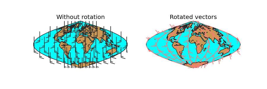
lons and lats are created in an equal spaced grid covering all the globe, using linspace
v10 and u10 are created so they represent a south to north wind (v10 = 10, u10 = 0)
The rotation is done, using the created matrices, and calculating the positions of the locatinos in the map projection (returnxy = True)
- Two maps are drawn, creating the subplots with add_subplot
The first draws the barbs without rotating them. Even though they are supposed to be south-north, the basemap instance takes them as if they were in the map projection, so the barbs go from the bottom to the top, which is not south to north
The second shows the result of the rotation
set_axes_limits
This method is usually called internally, and changes the matplotlib axes to the shape of the projection.
ax is the axis instance that needs its limits to be set
Most of the methods, such as drawcountries, drawrivers, readshapefile… call this method at the end, so it’s difficult to put an example to show how does it work:
from mpl_toolkits.basemap import Basemap
import matplotlib.pyplot as plt
fig = plt.figure()

map = Basemap(projection='ortho',
              lat_0=0, lon_0=0)

map.drawlsmask(land_color = "#ddaa66",
               ocean_color="#7777ff",
               resolution = 'c')


x1, y1 = map(-60, -30)
x2, y2 = map(0, 0)
x3, y3 = map(45, 45)

plt.plot([x1, x2, x3], [y1, y2, y3], color='k', linestyle='-', linewidth=2)

ax1 = fig.add_axes([0.1, 0., 0.15, 0.15])
ax1.set_xticks([])
ax1.set_yticks([])

ax1.plot([x1, x2, x3], [y1, y2, y3], color='k', linestyle='-', linewidth=2)

map.set_axes_limits(ax=ax1)

ax2 = fig.add_axes([0.3, 0., 0.15, 0.15])
ax2.set_xticks([])
ax2.set_yticks([])

ax2.plot([x1, x2, x3], [y1, y2, y3], color='k', linestyle='-', linewidth=2)

ax3 = fig.add_axes([0.5, 0., 0.15, 0.15])
ax3.set_xticks([])
ax3.set_yticks([])

map.plot([x1, x2, x3], [y1, y2, y3], color='k', linestyle='-', linewidth=2, ax=ax3)

plt.show()
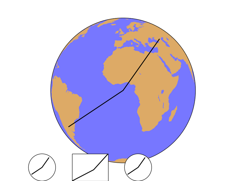
After creating the map, the points 1, 2 and 3 are calculated in the map coordinates using the Basemap instance
The line connecting the three points is plot on the main map
- Then, three new axes are created using fig.add_axes(x, y, width, height), in fractions of the plot size. In all the cases, the three points are plotted
The first axis uses the set_axes_limits, so the final shape is a circle, correct for the orthographic projection. Note that plot is called as a method from the axis, not from the Basemap instance
The second axis example doesn’t call the method, so the shape is not correct. The plot method is also called from the axis instance
In the third case, the plot method is called from the Basemap instance, so the method set_axes_limits is called internally from the basemap.plot method, and the final shape is correct
shiftdata
Adds values to the longitudes so they can fit the correct map origin. Changes also the data array so it can fit the new origin. Sometimes, the longitude data is given in an interval different from -180, 180. From 0 to 360, for instance. To draw the data properly, this values must be shifted.
shiftdata(lonsin, datain=None, lon_0=None)
lonsin the original longitudes. They have to be either a one dimension or two dimension arrays, but always in a regular lat/lon grid
datain is the data array. If the longitudes have to be cut (-180 becomes 360, for instance), the order of the data array has to be changed. If the data is given, this operation is done
lon_0 is the map origin. The longitudes will be fit in the interval [lon_0-180,lon_0+180]
from mpl_toolkits.basemap import Basemap
import matplotlib.pyplot as plt
import numpy as np

map = Basemap(projection='sinu',
              lat_0=0, lon_0=0)

lons = np.arange(30, 390, 30)
lats = np.arange(0, 100, 10)

data = np.indices((lats.shape[0], lons.shape[0]))
data = data[0] + data[1]

print data

print lons

lons, data = map.shiftdata(lons, datain = data, lon_0=0)

print lons

llons, llats = np.meshgrid(lons, lats)

x, y = map(llons, llats)

map.contourf(x, y, data)

map.drawcoastlines()
plt.show()
- The coordinates and data arrays are fake data. Coordinates are created with a simple range, and the data array is the sum of the x and y positions, so the lower left position will be the one with a lower data value, and the highest, the upper right
Note that longitudes start at 30
The longitudes and data is shifted using the shiftdata method
The new coordinated are passed to 2d using meshgrid, and re-projected to the map projection using the basemap instance
The filled contour can be now created
The final result has a white band, which could be avoided using the addcyclic method: addcyclic
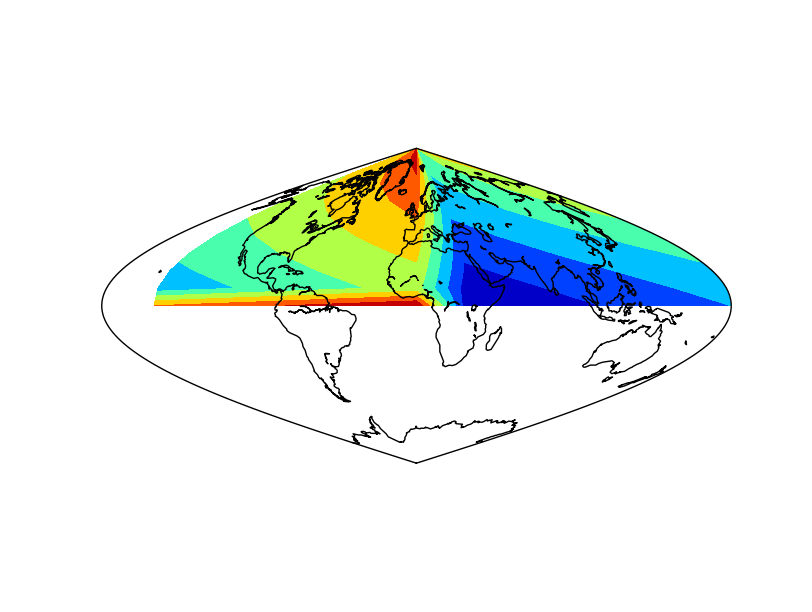
The result applying the method to the data array
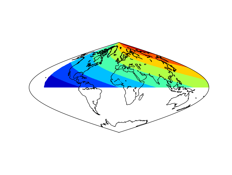
The result without applying the method to the data array. Not that the blue (value 0) is not at longitude 0
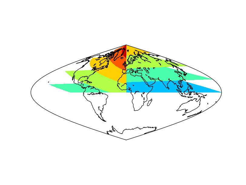
The result without applying shiftdata. Note that the result is not as expected, since the longitudes are outside the right interval
shiftgrid
This function, similar to shiftdata, moves all the longitudes and data east or west.
basemap.shiftgrid(lon0, datain, lonsin, start=True, cyclic=360.0)
Note that it’s not a basemap method, but a separate function
lon0 The starting or ending longitude for the final grid. The value must be in the interval of the input longitudes, so sometimes must be set as the starting, and others as the ending with the start argument
datain the input data array, that will be re-ordered according to the longitudes
lonsin the input longitudes to be shifted. It’s a 1D numpy array, but doesn’t have to be in a regular interval
start argument, which is True by default, sets if the lon0 is the longitude of the initial longitude or the final one at the output array
cyclic sets the longitude value where the longitudes start again to lon0
The function returns the re-ordered data and the shifted longitudes
..note: The main difference from shiftdata, is that the projection doesn’t need to be cylindrical, since it’s not a method from the basemap instance, and that the longitudes don’t need to have a uniform incerement
from mpl_toolkits.basemap import Basemap
from mpl_toolkits.basemap import shiftgrid
import matplotlib.pyplot as plt
import numpy as np

map = Basemap(projection='sinu',
              lat_0=0, lon_0=0)

lons = np.arange(30, 410, 30)
lons[1] = 70
lats = np.arange(0, 100, 10)

data = np.indices((lats.shape[0], lons.shape[0]))
data = data[0] + data[1]

print data
print lons

data, lons = shiftgrid(180., data, lons, start=False)

print data
print lons

llons, llats = np.meshgrid(lons, lats)

x, y = map(llons, llats)

map.contourf(x, y, data)
map.drawcoastlines()
plt.show()
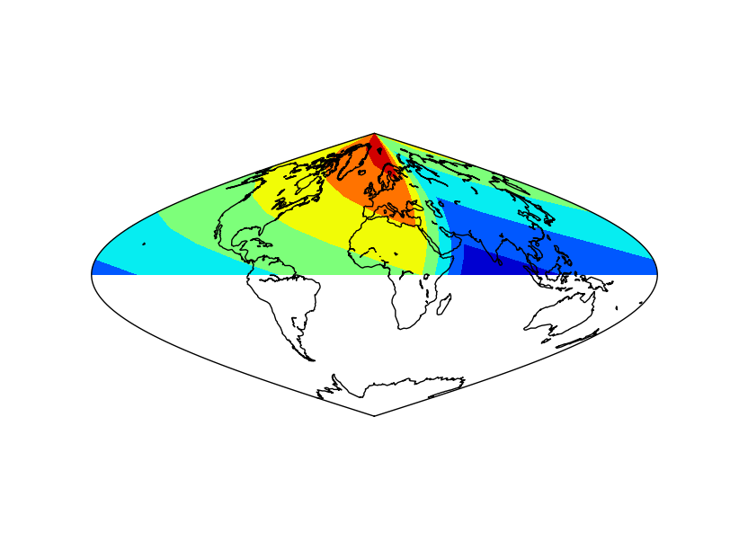
- The coordinates and data arrays are fake data. Coordinates are created with a simple range, and the data array is the sumatory of the x and y positions, so the lower left position will be the one with a lower data value, and the highest, the upper right
Note that longitudes start at 30
The second element should be 60, but is changed to 70 to show that the interval doesn’t have to be regular, not as in shiftdata
- The longitudes and data is shifted using the shiftgrid method
The lon0 is set to 180, and the start to False, so the final longitude will be 180, and the ones passing this value, will be passed to -180
It’s not possible to set lon0 to -180, since is outside the input longitudes interval, so the avobe trick must be used
The new coordinated are passed to 2d using meshgrid, and re-projected to the map projection using the basemap instance
The filled contour can be now created
tissot
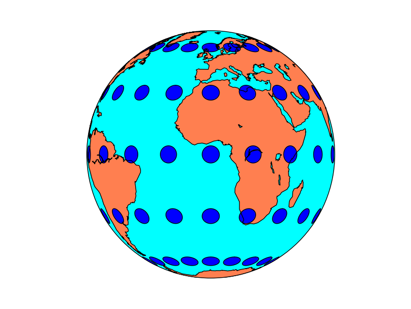
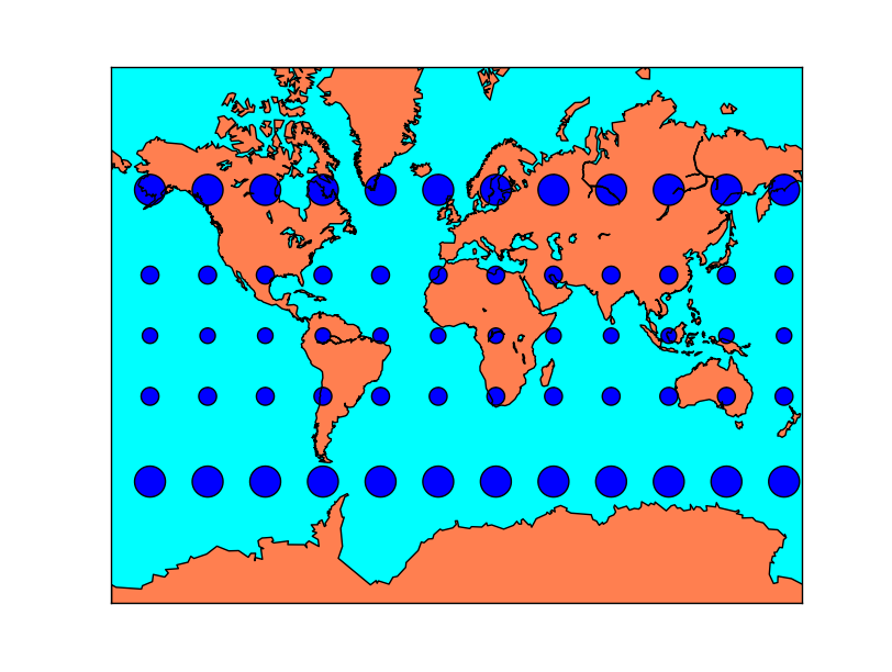
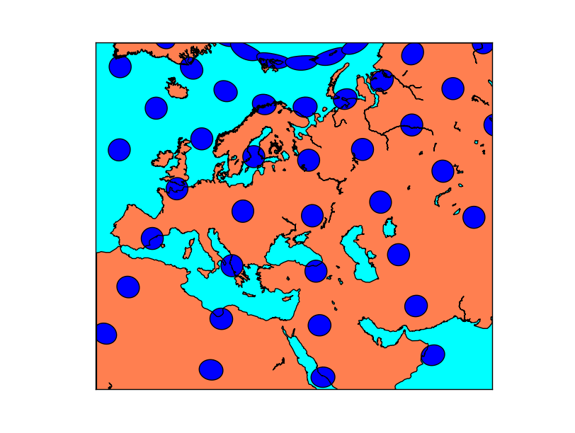
Tissot’s indicatrix, or Tissot’s ellipse of distortion is the representation of a circle in a map, showing how the projection distorts it. Usually, many of them are represented to show how the distortion varies with the position.
The function has the following arguments:
tissot(lon_0, lat_0, radius_deg, npts, ax=None, **kwargs)
lon_0 and lat_0 indicate the position of the Tissot’s ellipse
radius_deg indicates the radius of the polygon
npts Is the number of vertices of the polygon that will be used to approximate the ellipse. A higher npts will make better approached ellipses
Note
If the circle gets cut by the edges of the map, i.e. starts at longitude -179 and ends at 179, the method can’t handle it properly
from mpl_toolkits.basemap import Basemap
import matplotlib.pyplot as plt

map = Basemap(projection='ortho',
              lat_0=0, lon_0=0)

map.drawmapboundary(fill_color='aqua')
map.fillcontinents(color='coral',lake_color='aqua')
map.drawcoastlines()

for lon in range(0, 360, 20):
    for lat in range(-60, 90, 30):
        map.tissot(lon, lat, 4, 50)

plt.show()
Tissot’s indicatrices for the Orthographic projection:
Tissot’s indicatrices for the Mercator projection:
Tissot’s indicatrices for the Albers Equal Area projection:
transform_scalar
Given a matrix with scalar values in a cylindrical projection, and the longitude and latitude of the points, interpolates the points to a new matrix..
datain is a 2d numpy array with the scalar values
lons, lats are 1D numpy arrays with the positions of the uin an vin matrices, in geographical coordinates. The input lon-lat grid has to be regular (projections cyl, merc, mill, cea and gall)
nx and ny are the x any y dimensions of the output grid. The output grid covers all the map, not the original points outside its domain. So the final number of points visible on the map will be nx x ny
returnxy makes the method to return the lons and lats matrices reprojected to the map coordinates. Just as calling the basemap instance
checkbounds if set to True, the xin and yin values are checked to be in the bounds of xout and yout. If False, and there are values outside the bounds, the output data array values will be clipped to the boundary values
masked makes the points outside the new grid to be masked if is set to True, or an arbitrary value if given
- order sets the interpolation method:
0 uses the nearest neighbor method
1 uses a bilinear interpolation
3 uses a cubic spline, and requires scipy.ndimage to be installed
Note
When the input matrix is not regular in longitude-latitude (i.e. is not a cylindric projection), this method can’t be used properly, since the longitude-latitude grid won’t be regular. See the interp example for a solution.
from mpl_toolkits.basemap import Basemap
from mpl_toolkits.basemap import shiftgrid
import matplotlib.pyplot as plt
from osgeo import gdal
import numpy as np

fig=plt.figure(figsize=(9, 3))

map = Basemap(projection='merc',
              lat_0=0,
              resolution='h',
              llcrnrlon=32,
              llcrnrlat=31,
              urcrnrlon=33,
              urcrnrlat=32)

ds = gdal.Open("../sample_files/dem.tiff")
data = ds.ReadAsArray()

lons = np.linspace(0, 40, data.shape[1])
lats = np.linspace(0, 35, data.shape[0])

ax = fig.add_subplot(121)
ax.set_title('Without transform_scalar')

llons, llats = np.meshgrid(lons, lats)
x, y = map(llons, llats)

map.pcolormesh(x, y, data, vmin=900, vmax=950)

map.drawcoastlines()

ax = fig.add_subplot(122)
ax.set_title('Applying transform_scalar')

data_interp, x, y = map.transform_scalar(data, lons, lats, 40, 40, returnxy=True)

map.pcolormesh(x, y, data_interp, vmin=900, vmax=950)

map.drawcoastlines()

plt.show()
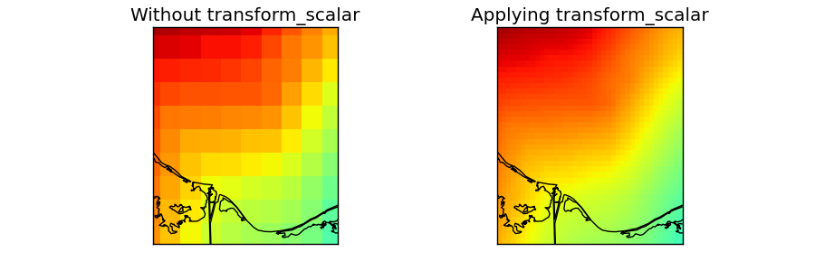
The data taken for this example is a DEM data for another region and projection, but we’ll use fake longitudes and latitudes so it can be used.
numpy linspace is used to generate an equal spaced longitudes and latitudes arrays. They have to be 1D to use transform_scalar, so the projection has to be cylindrical (projections cyl, merc, mill, cea and gall)
- The original field is drawn on the first map
lons and lats are converted first to 2D arrays using meshgrid
The longitudes and latitudes are converted to the mercator projection using the basemap instance
pcolormesh is used to draw the result, taking care to set the maximum and minimum values, so the two maps behave the same way
- transform_scalar is applied
The returnxy argument set to true, so the new grid positions can be get easily
The size of the new grid will be 40x40, so the pixels are still visible, but small. A bigger number would make the pixels to be much smaller
The same ref:pcolormesh is used to plot the data. The maximum and minimum values are the same as in the later case. If not, the function would assume only the values in the map region, so the colors would be different
Note
Masked doesn’t seem to work
from mpl_toolkits.basemap import Basemap
import matplotlib.pyplot as plt
import numpy as np


fig=plt.figure(figsize=(9, 3))

map = Basemap(projection='robin',
              lat_0=0, lon_0=0)

lons = np.arange(-180, 190, 60)
lats = np.arange(-90, 100, 30)

data = np.indices((lats.shape[0], lons.shape[0]))
data = data[0] + data[1]

llons, llats = np.meshgrid(lons, lats)

ax = fig.add_subplot(121)
ax.set_title('Without transform_scalar')

x, y = map(llons, llats)

map.pcolormesh(x, y, data, cmap='Paired')

map.drawcoastlines()

ax = fig.add_subplot(122)
ax.set_title('Applying transform_scalar')

data_interp, x, y = map.transform_scalar(data, lons, lats, 50, 30, returnxy=True, masked=True)

map.pcolormesh(x, y, data_interp, cmap='Paired')

map.drawcoastlines()

plt.show()
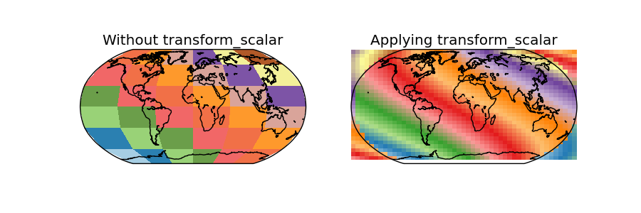
In this case, the data is the same as the used in the shiftdata example
- Since the map covers the whole world, some of the points in the output grid are outside the world
Using masked = True, those points should have no-data values, but this doesn’t seem to work, and the points are drawn anyway, creating a very strange effect
transform_vector
Given two matrices of the east-west and north-south components of a vectorial field in a cylindrical projection, and the longitude and latitude of the points, rotates the vectors so they represent the direction properly on the map projection, while interpolates the points to a new matrix..
Some functions, such as barbs, quiver or streamplot, that use vectorial data, asks the vector components to be in the map coordinates i.e. u is from left to right, v from up do down. If the available data is in geographical coordinates i.e. west-east and north-south, these coordinates have to be rotated or the vector direction won’t be plot properly. This is the aim of the rotate_vector method.
When drawing barbs, quiver or stream lines, the number of available points may be too low, so interpolating them to a new matrix with more elements can be used to get a plot with a nice number of elements.
The method rotate_vector does the same function, but without interpolating the points
uin and vin are the input data matrices. The directions are the geographical, so the u component is west-east and the v component, north-south
lons, lats are 1D numpy arrays with the positions of the uin an vin matrices, in geographical coordinates. The input lon-lat grid has to be regular (projections cyl, merc, mill, cea and gall)
nx and ny are the x any y dimensions of the output grid. The output grid covers all the map, not the original points outside its domain. So the final number of points visible on the map will be nx x ny
returnxy makes the method to return the lons and lats matrices reprojected to the map coordinates. Just as calling the basemap instance
checkbounds if set to True, the xin and yin values are checked to be in the bounds of xout and yout. If False, and there are values outside the bounds, the output data array values will be clipped to the boundary values
masked makes the points outside the new grid to be masked if is set to True, or an arbitrary value if given
- order sets the interpolation method:
0 uses the nearest neighbor method
1 uses a bilinear interpolation
3 uses a cubic spline, and requires scipy.ndimage to be installed
Note
When the input matrix is not regular in longitude-latitude (i.e. is not a cylindric projection), this method can’t be used properly, since the longitude-latitude grid won’t be resular. See the interp example for a solution.
from mpl_toolkits.basemap import Basemap
import matplotlib.pyplot as plt
from osgeo import gdal
import numpy as np

map = Basemap(projection='sinu',
              lat_0=0, lon_0=0)

lons = np.linspace(-180, 180, 8)
lats = np.linspace(-90, 90, 8)

v10 = np.ones((lons.shape)) * 15
u10 = np.zeros((lons.shape))

u10, v10 = np.meshgrid(u10, v10)

u10_rot, v10_rot, x_rot, y_rot = map.transform_vector(u10, v10,
                                                      lons, lats,
                                                      15, 15,
                                                      returnxy=True)

map.drawmapboundary(fill_color='#9999FF')
map.fillcontinents(color='#ddaa66', lake_color='#9999FF', zorder = 0)
map.drawcoastlines(color = '0.15')

#Drawing the original points
lons, lats = np.meshgrid(lons, lats)
x, y = map(lons, lats)
map.barbs(x, y, u10, v10,
    pivot='middle', barbcolor='#333333')

#Drawing the rotated & interpolated points
map.barbs(x_rot, y_rot, u10_rot, v10_rot,
    pivot='middle', barbcolor='#ff5555')

plt.show()
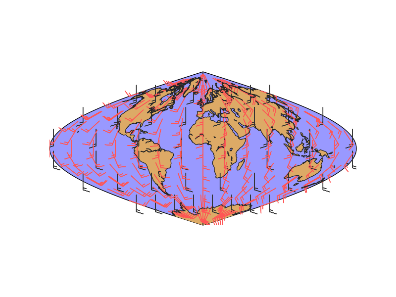
lons and lats are created in an equal spaced grid covering all the globe, using linspace
v10 and u10 are created so they represent a south to north wind (v10 = 10, u10 = 0). They are transformed to a 2D array using numpy.meshgrid
- Once the data is created, the rotated and interpolated vectors and the new grid are created using transform_vector
Setting nx and ny to 15, the new grid will be 15x15 in the map projection, so this is the final number of points visible in the final map
The original and rotated-interpolated fields are drawn