Plotting data
annotate
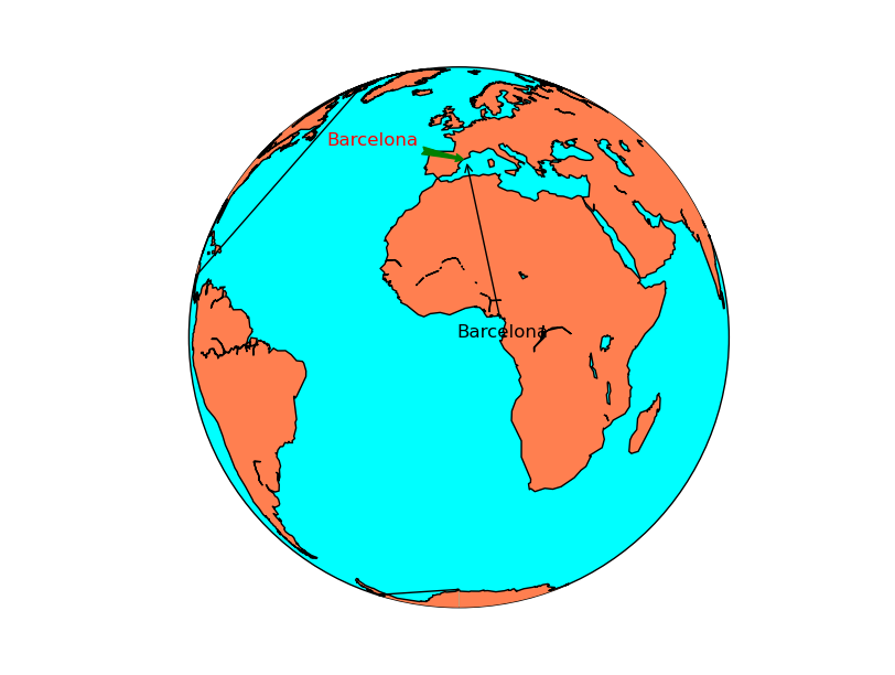
Creates text with an arrow indicating the point of interest. To create a text without an arrow, look at the text section.
The text method does not belong to Basemap, but directly to matplotlib, so it must be called from the plot or axis instance
The first argument is the text string
xy is a list with the x and y coordinates of the point pointed by the arrow. This will be interprete depending on the xycoords argument
- xycoords indicates the type of coordinates used in xy:
data means the coordinates are the ones used by the data (the projection coordinates)
offset points means an offset in points
axes pixels indicates pixels from the lower left corner of the axes
The other options are at the annotation docs
xytext a list with the x and y coordinates of the text, an the beginning of the arrow
textcoords indicates the type of coordinates used in xytext, with the same options as in xycoords
arrowprops this optional argument sets the arrow properties, as explained in the Line2D docs
color the color of the text. This page explains all the color options
from mpl_toolkits.basemap import Basemap
import matplotlib.pyplot as plt


map = Basemap(projection='ortho',
              lat_0=0, lon_0=0)

map.drawmapboundary(fill_color='aqua')
map.fillcontinents(color='coral',lake_color='aqua')
map.drawcoastlines()


x, y = map(2, 41)
x2, y2 = (-90, 10)

plt.annotate('Barcelona', xy=(x, y),  xycoords='data',
                xytext=(x2, y2), textcoords='offset points',
                color='r',
                arrowprops=dict(arrowstyle="fancy", color='g')
                )

x2, y2 = map(0, 0)
plt.annotate('Barcelona', xy=(x, y),  xycoords='data',
                xytext=(x2, y2), textcoords='data',
                arrowprops=dict(arrowstyle="->")
                )
plt.show()
barbs
Plots wind barbs on the map
barbs(x, y, u, v, *args, **kwargs)
The barbs docs from the matplotlib documentation is much more detailed.
x and y give the positions of the grid data if the latlon argument is true, the values are supposed to be in geographical coordinates. If not, in the map coordinates
- u and v are the left-right and up-down magnitudes of the wind in knots (the values to create the barbs are 5, 10, 15 and so on).
Note that they are NOT in north-south ans west-east. If the input projection has non-cylindrical projections (those other than cyl, merc, cyl, gall and mill), the u and v should be rotated, using rotate_vector or transform_scalar methods
There are many other optional arguments, documented at the matplotlib docs. Some interesting arguments are:
pivot changes the point of rotation of the barbs. By default is “tip”, but can be changed to “middle”
barbcolor changes the color. If a sequence, the colors are alternated with the sequence values
fill_empty fills the circles when the wind is lower than 5 kt
barb_increments can be used to change the values where the barbs add ticks and flags
from mpl_toolkits.basemap import Basemap
import matplotlib.pyplot as plt
from osgeo import gdal
import numpy as np


map = Basemap(llcrnrlon=-93.7, llcrnrlat=28., urcrnrlon=-66.1, urcrnrlat=39.5,
              projection='lcc', lat_1=30., lat_2=60., lat_0=34.83158, lon_0=-98.)

ds = gdal.Open("../sample_files/wrf.tiff")
lons = ds.GetRasterBand(4).ReadAsArray()
lats = ds.GetRasterBand(5).ReadAsArray()
u10 = ds.GetRasterBand(1).ReadAsArray()
v10 = ds.GetRasterBand(2).ReadAsArray()

x, y = map(lons, lats)

yy = np.arange(0, y.shape[0], 4)
xx = np.arange(0, x.shape[1], 4)

points = np.meshgrid(yy, xx)

map.drawmapboundary(fill_color='aqua')
map.fillcontinents(color='#cc9955', lake_color='aqua', zorder = 0)
map.drawcoastlines(color = '0.15')

map.barbs(x[points], y[points], u10[points], v10[points],
    pivot='middle', barbcolor='#333333')


plt.show()
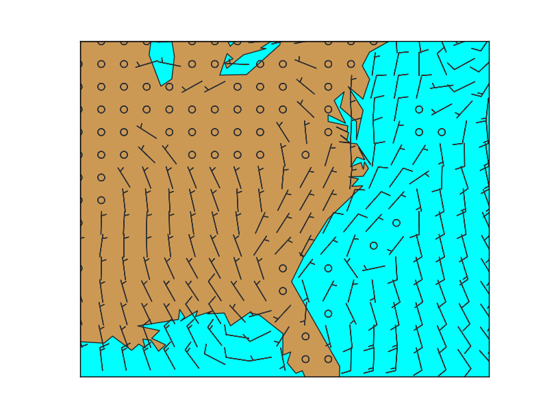
- The main problem when using barbs is that the point density may be too high, and the method can’t skip points by itself.
To do it, a matrix taking only 1/4 th of the elements is created
The matrix points has the element positions to take
The arguments passed to barbs are selected using the points matrix, so taking only one of every 4 elements
u and v are supposed to be in the map coordinates, not north-south or west-east. If they were in geographical coordinates, rotate_vector could be used to rotate them properly
The pivot argument has been used to rotate the barbs from the middle, since the effect rotating from the upper part (pivot = “tip”) creates strange effects when the wind rotates
contour
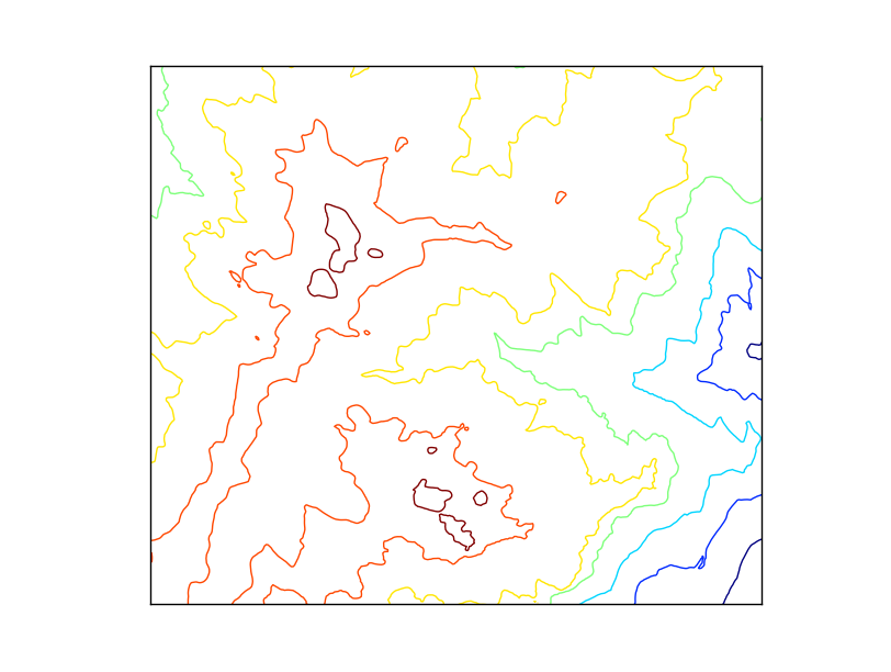
Creates a contour plot.
x and y are matrices of the same size as data, containing the positions of the elements in the map coordinates
data is the matrix containing the data values to plot
A fourth argument can be passed, containing a list of the levels to use when creating the contour
The default colormap is jet, but the argument cmap can be used to change the behavior
The argument tri = True makes the grid to be assumed as unstructured. See this post to check the differences
Other possible arguments are documented in the matplotlib function docs
Labels can be added to the contour result, as in the contour example at basic functions section
from mpl_toolkits.basemap import Basemap
import matplotlib.pyplot as plt
from osgeo import gdal
from numpy import linspace
from numpy import meshgrid

map = Basemap(projection='tmerc',
              lat_0=0, lon_0=3,
              llcrnrlon=1.819757266426611,
              llcrnrlat=41.583851612359275,
              urcrnrlon=1.841589961763497,
              urcrnrlat=41.598674173123)

ds = gdal.Open("../sample_files/dem.tiff")
data = ds.ReadAsArray()

x = linspace(0, map.urcrnrx, data.shape[1])
y = linspace(0, map.urcrnry, data.shape[0])

xx, yy = meshgrid(x, y)

map.contour(xx, yy, data)

plt.show()
contourf
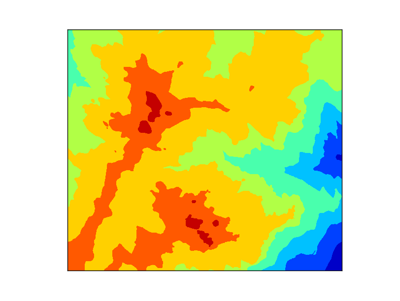
Creates a filled contour plot.
x and y are matrices of the same size as data, containing the positions of the elements in the map coordinates
data is the matrix containing the data values to plot
The default colormap is jet, but the argument cmap can be used to change the behavior
A fourth argument can be passed, containing a list of the levels to use when creating the contourf
The argument tri = True makes the grid to be assumed as unstructured. See this post to check the differences
Other possible arguments are documented in the matplotlib function docs
from mpl_toolkits.basemap import Basemap
import matplotlib.pyplot as plt
from osgeo import gdal
from numpy import linspace
from numpy import meshgrid

map = Basemap(projection='tmerc',
              lat_0=0, lon_0=3,
              llcrnrlon=1.819757266426611,
              llcrnrlat=41.583851612359275,
              urcrnrlon=1.841589961763497,
              urcrnrlat=41.598674173123)

ds = gdal.Open("../sample_files/dem.tiff")
data = ds.ReadAsArray()

x = linspace(0, map.urcrnrx, data.shape[1])
y = linspace(0, map.urcrnry, data.shape[0])

xx, yy = meshgrid(x, y)

map.contourf(xx, yy, data)

plt.show()
hexbin
Plots an hexagonal bin from a set of positions. Can plot the number of occurrences in each bin (hexagon) or give a weight to each occurrence
The information is much better at the matplotlib.hexbin docs
x and y are numpy arrays with the coordinates of the points. Regular lists won’t work, they have to be numpy arrays.
gridsize sets the number of bins (hexagons) in the x direction. By default is 100
C argument is also a numpy array with the values at each point. Those values are processed by default with numpy.mean function at each bin (hexagon)
reduce_C_function is the function applied to the elements in each bin (hexagon). By default, is numpy.mean
- bins argument can change the behavior of the counting function.
By default is None, which means that the number of occurrences are plotted.
“log” makes the logarithm of the number of occurrences is plotted
An integer value divides the number of occurrences by this number (useful for percentages if the number is the total of points)
A sequence makes the lower bound of the bin to be used
mincnt is the minimum of occurrences in each bin (hexagon) to be plotted. By default is 0, so to avoid plotting hexagons without occurrences, set it to 1
cmap sets the color map
edgecolors is the color of the hexagons border. This linewidths argument must not be None to see a result
linewidths is the line width of the edge of the hexagons. By default is None, so no borders are plot
alpha sets the transparency of the layer
Note
Old versions of the library don’t supoort hexbin
 1from mpl_toolkits.basemap import Basemap
 2import matplotlib.pyplot as plt
 3import matplotlib.colors as colors
 4from numpy import array
 5from numpy import max
 6
 7
 8map = Basemap(llcrnrlon=-0.5,llcrnrlat=39.8,urcrnrlon=4.,urcrnrlat=43.,
 9             resolution='i', projection='tmerc', lat_0 = 39.5, lon_0 = 1)
10
11
12map.readshapefile('../sample_files/lightnings', 'lightnings')
13
14x = []
15y = []
16c = []
17
18for info, lightning in zip(map.lightnings_info, map.lightnings):
19    x.append(lightning[0])
20    y.append(lightning[1])
21
22    if float(info['amplitude']) < 0:
23        c.append(-1 * float(info['amplitude']))
24    else:
25        c.append(float(info['amplitude']))
26
27plt.figure(0)
28
29map.drawcoastlines()
30map.readshapefile('../sample_files/comarques', 'comarques')
31
32map.hexbin(array(x), array(y))
33
34map.colorbar(location='bottom')
35
36
37
38plt.figure(1)
39
40map.drawcoastlines()
41map.readshapefile('../sample_files/comarques', 'comarques')
42
43map.hexbin(array(x), array(y), gridsize=20, mincnt=1, cmap='summer', bins='log')
44
45map.colorbar(location='bottom', format='%.1f', label='log(# lightnings)')
46
47
48
49plt.figure(2)
50
51map.drawcoastlines()
52map.readshapefile('../sample_files/comarques', 'comarques')
53
54map.hexbin(array(x), array(y), gridsize=20, mincnt=1, cmap='summer', norm=colors.LogNorm())
55
56cb = map.colorbar(location='bottom', format='%d', label='# lightnings')
57
58cb.set_ticks([1, 5, 10, 15, 20, 25, 30])
59cb.set_ticklabels([1, 5, 10, 15, 20, 25, 30])
60
61
62
63
64plt.figure(3)
65
66map.drawcoastlines()
67map.readshapefile('../sample_files/comarques', 'comarques')
68
69map.hexbin(array(x), array(y), C = array(c), reduce_C_function = max, gridsize=20, mincnt=1, cmap='YlOrBr', linewidths=0.5, edgecolors='k')
70
71map.colorbar(location='bottom', label='Mean amplitude (kA)')
72
73
74plt.show()
The example creates four examples to show different options
Lines 14 to 25 read all the points, corresponding to lightning data, as explained at the section Reading point data.
The first example shows the minimum use of hexbin. Note that the bins are quite small, that the zones with no occurrences are plotted with dark blue while the zones outside the shapefile data bounding box stay without data
The second example changes the bin (hexagon) size using the gridsize argument, sets a minimum of occurrences to plot the data with mincnt and makes the colors to behave in a logarithmic scale with bins. Note that the color bar shows the value of the logarithm
To avoid the color bar to show the logarithm value, I found this solution at StackOverflow that substitutes the bins argument but draws the same while getting a better color bar
- The last example shows how to use the C argument.
- The amplitude module of the lightning has been stored at the c variable, and passed to the C argument
The reduce_C_function argument is used to show the maximum value in each bin instead of the mean
linewidths and edgecolors make a border to be plotted in each hexagon
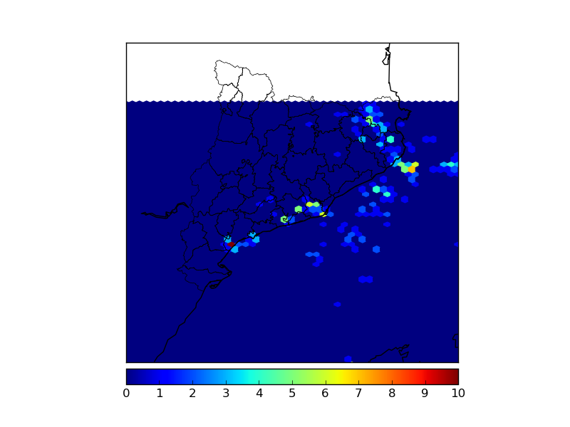
Basic usage
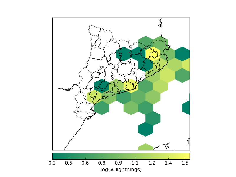
Log scale, different hexagon size
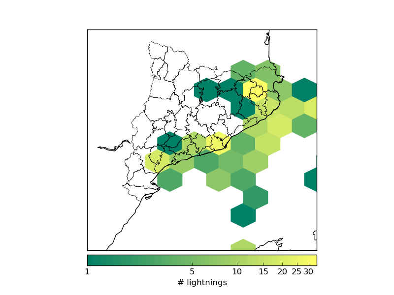
Log scale with a more convenient color bar
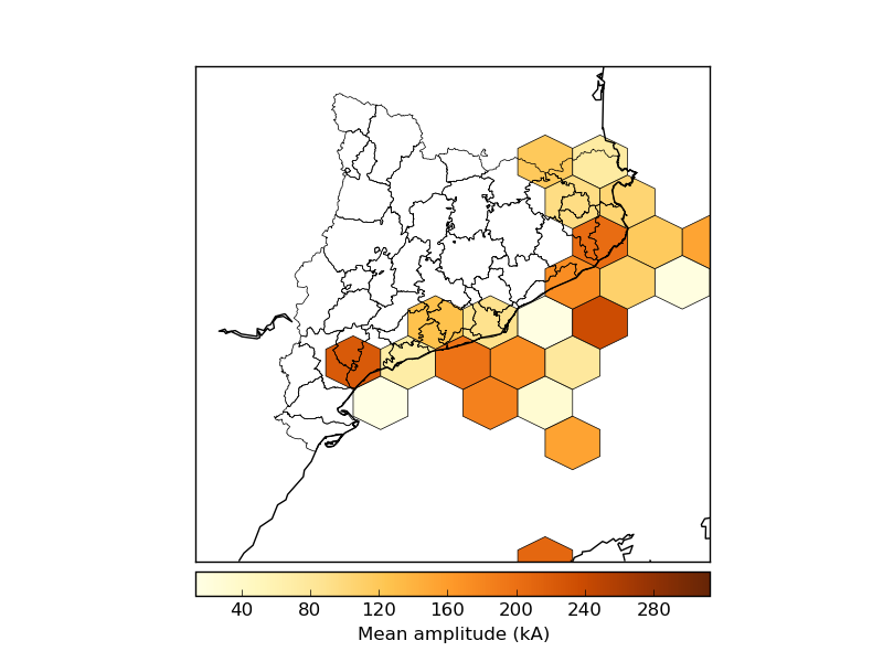
Using the C argument and plotting the bin edges
imshow
Plots an image on the map. The image can be a regular rgb image, or a field colored with a cmap.
As in other cases, the best docs are at the matplotlib documentation.
The first argument is the image array. If it has three bands, RGB will be assumed, and the image will be plotted. If it has one band, a pseudocolor will be created according to the cmap argument (jet by default). Arrays with two or more than three bands will make the method tp raise an error
extent sets the position of four corners of the image, in map coordinates. It has to be a sequence with the elements (x0, x1, y0, y1)
origin changes the initial line position of the image. By default, the first line position is defined by image.origin, and this can be changed using the values “upper” or “lower”
cmap is the desired colormap if the image has one band.
alpha sets the transparency with values from 0 to 1
interpolation changes the interpolation mode when resizing the image. Possible values are “none”, “nearest”, “bilinear”, “bicubic”, “spline16”, “spline36”, “hanning”, “hamming”, “hermite”, “kaiser”, “quadric”, “catrom”, “gaussian”, “bessel”, “mitchell”, “sinc”, “lanczos
The first example shows hot to use jpg image and a field as a pseudocolored image:
from mpl_toolkits.basemap import Basemap
from mpl_toolkits.basemap import shiftgrid
import matplotlib.pyplot as plt
from osgeo import gdal
import numpy as np

map = Basemap(projection='tmerc',
              lat_0=0, lon_0=3,
              llcrnrlon=1.819757266426611,
              llcrnrlat=41.583851612359275,
              urcrnrlon=1.841589961763497,
              urcrnrlat=41.598674173123)

ds = gdal.Open("../sample_files/dem.tiff")
elevation = ds.ReadAsArray()

map.imshow(plt.imread('../sample_files/orthophoto.jpg'))

map.imshow(elevation, cmap = plt.get_cmap('terrain'), alpha = 0.5)

plt.show()
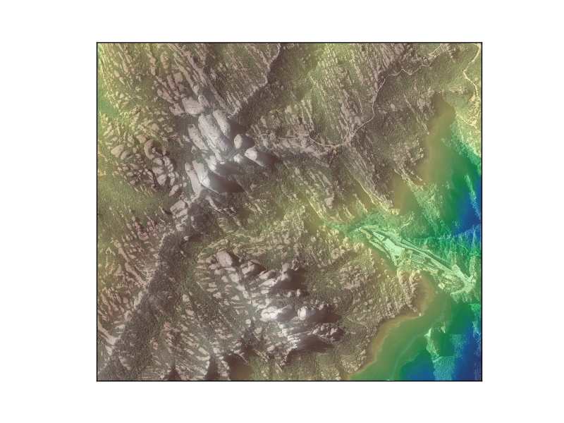
plt.imread reads any common image file into a numpy array
The elevation data is plotted with the terrain colormap and with an alpha value to allow viewing both layers at once
Note that the extent hasn’t been set, since the map extent is the same as the image extension
The second example shows how to add a logo directly on the map or on a new created axis:
from mpl_toolkits.basemap import Basemap
import matplotlib.pyplot as plt
fig = plt.figure()

map = Basemap(projection='ortho',
              lat_0=0, lon_0=0)

map.drawlsmask(land_color = "#ddaa66",
               ocean_color="#7777ff",
               resolution = 'l')

x0, y0 = map(1., 31.)
x1, y1 = map(15., 39.)

plt.imshow(plt.imread('../sample_files/by.png'),  extent = (x0, x1, y0, y1))

axicon = fig.add_axes([0.1, 0., 0.15, 0.15])
axicon.imshow(plt.imread('../sample_files/by.png'), origin = 'upper')
axicon.set_xticks([])
axicon.set_yticks([])

plt.show()
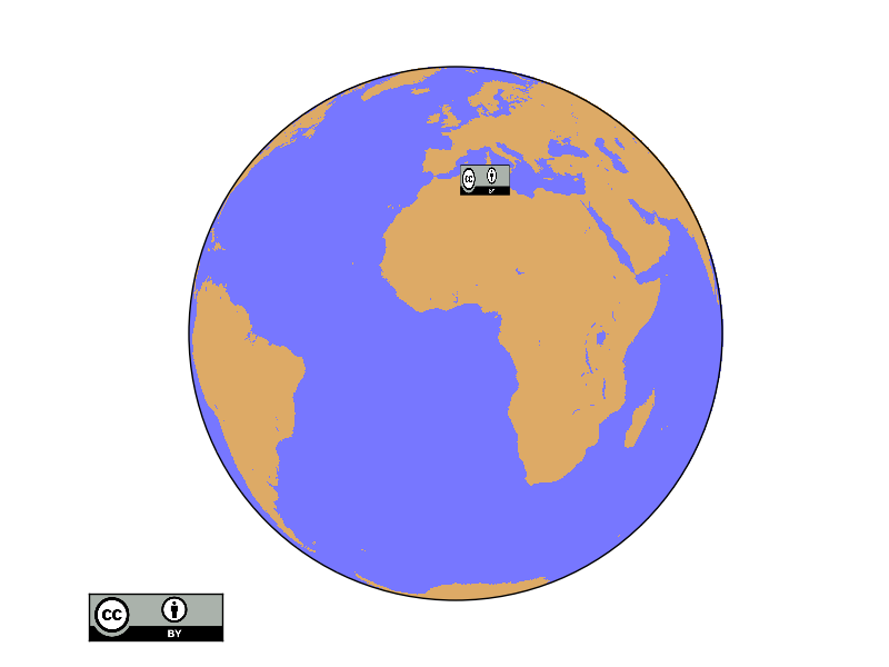
The first icon is drawn on the map using the extent argument. The coordinates have been converted to the map units
- The second logo is outside the globe, so no map coordinates can be used to place it properly
An axis named axicon is created. The numbers set the x and y position, and width and height of the axis. All them in fractions of the plot size.
The image is plotted, but with the argument origin to avoid to have upside down
xticks and ytixcks are set to null, so they are not drawn on the logo
pcolor
The behavior of this function is almost the same as in pcolormesh. A good explanation here
pcolormesh
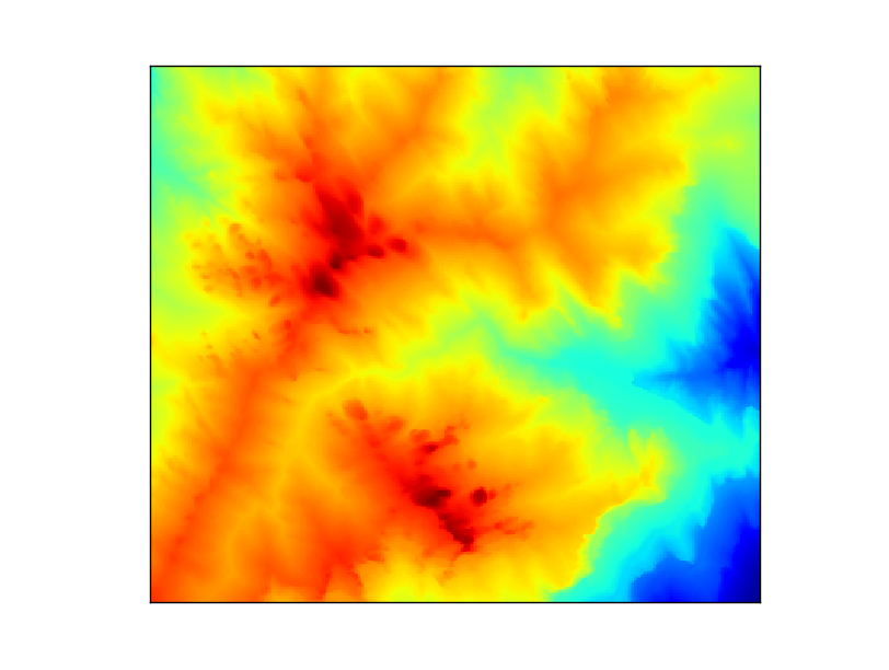
Creates a pseudo-color plot
pcolormesh(x, y, data, *args, **kwargs)
x and y are matrices of the same size as data, containing the positions of the elements in the map coordinates
data is the matrix containing the data values to plot
The default colormap is jet, but the argument cmap can be used to change the behavior
Other possible arguments are documented in the matplotlib function docs
from mpl_toolkits.basemap import Basemap
import matplotlib.pyplot as plt
from osgeo import gdal
from numpy import linspace
from numpy import meshgrid

map = Basemap(projection='tmerc',
              lat_0=0, lon_0=3,
              llcrnrlon=1.819757266426611,
              llcrnrlat=41.583851612359275,
              urcrnrlon=1.841589961763497,
              urcrnrlat=41.598674173123)

ds = gdal.Open("../sample_files/dem.tiff")
data = ds.ReadAsArray()

x = linspace(0, map.urcrnrx, data.shape[1])
y = linspace(0, map.urcrnry, data.shape[0])

xx, yy = meshgrid(x, y)

map.pcolormesh(xx, yy, data)

plt.show()
plot
Plots markers or lines on the map
The function has the following arguments:
x and y can be either a float with the position of a marker in the projection units, or lists with the points form drawing a line
If latlon keyword is set to True, x,y are interpreted as longitude and latitude in degrees. Won’t work in old basemap versions
By default, the marker is a point. This page explains all the options
By default, the color is black (k). This page explains all the color options
The first example shows a single point:
from mpl_toolkits.basemap import Basemap
import matplotlib.pyplot as plt

map = Basemap(projection='ortho',
              lat_0=0, lon_0=0)

map.drawmapboundary(fill_color='aqua')
map.fillcontinents(color='coral',lake_color='aqua')
map.drawcoastlines()

x, y = map(0, 0)

map.plot(x, y, marker='D',color='m')

plt.show()

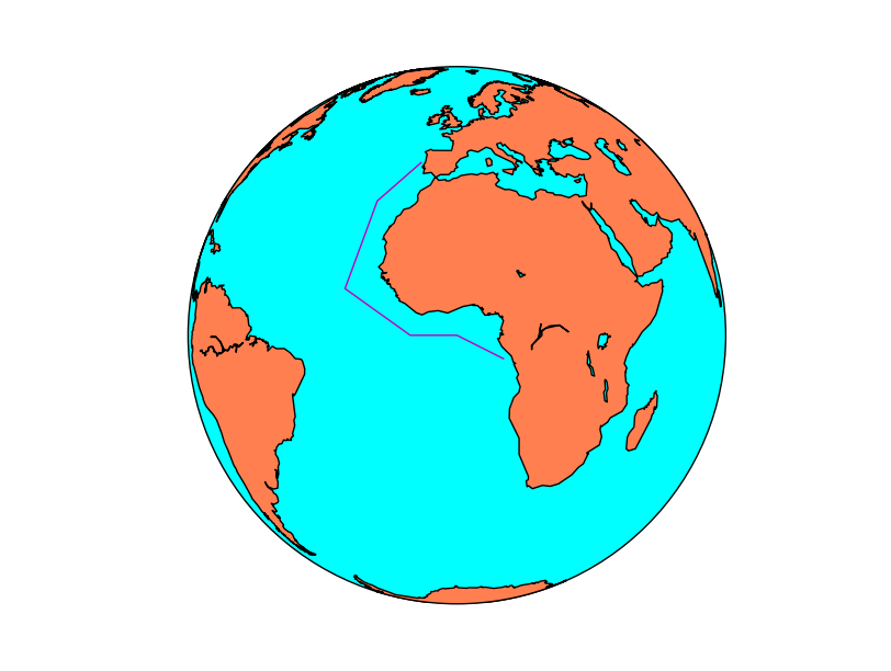
If the arguments are arrays, the output is a line (without markers in this case):
from mpl_toolkits.basemap import Basemap
import matplotlib.pyplot as plt

map = Basemap(projection='ortho',
              lat_0=0, lon_0=0)

map.drawmapboundary(fill_color='aqua')
map.fillcontinents(color='coral',lake_color='aqua')
map.drawcoastlines()

lons = [-10, -20, -25, -10, 0, 10]
lats = [40, 30, 10, 0, 0, -5]

x, y = map(lons, lats)

map.plot(x, y, marker=None,color='m')

plt.show()
quiver
Plots a vector field on the map. Many of the behavior is similar to the barbs method.
quiver(x, y, u, v, *args, **kwargs)
The documentation at matplotlib is much more detailed than at the basemap docs.
x and y give the positions of the grid data if the latlon argument is true, the values are supposed to be in geographical coordinates. If not, in the map coordinates
- u and v are the left-right and up-down magnitudes
Note that they are NOT in north-south ans west-east. If the input projection has non-cylindrical projections (those other than cyl, merc, cyl, gall and mill), the u and v should be rotated, using rotate_vector or transform_scalar methods
The fifth argument, which is optional, sets a value to assign the color to the arrow
scale makes the arrows to be longer or shorter
minshaft value below which arrow grows. The value should be greater than 1
pivot changes the point of rotation of the arrows. By default is “tip”, but can be changed to “middle”
from mpl_toolkits.basemap import Basemap
import matplotlib.pyplot as plt
from osgeo import gdal
import numpy as np


map = Basemap(llcrnrlon=-93.7, llcrnrlat=28., urcrnrlon=-66.1, urcrnrlat=39.5,
              projection='lcc', lat_1=30., lat_2=60., lat_0=34.83158, lon_0=-98.)

ds = gdal.Open("../sample_files/wrf.tiff")
lons = ds.GetRasterBand(4).ReadAsArray()
lats = ds.GetRasterBand(5).ReadAsArray()
u10 = ds.GetRasterBand(1).ReadAsArray()
v10 = ds.GetRasterBand(2).ReadAsArray()
speed = np.sqrt(u10*u10 + v10*v10)

x, y = map(lons, lats)

yy = np.arange(0, y.shape[0], 4)
xx = np.arange(0, x.shape[1], 4)

points = np.meshgrid(yy, xx)

map.drawmapboundary(fill_color='aqua')
map.fillcontinents(color='#cc9955', lake_color='aqua', zorder = 0)
map.drawcoastlines(color = '0.15')

map.quiver(x[points], y[points],
    u10[points], v10[points], speed[points],
    cmap=plt.cm.autumn)

plt.show()
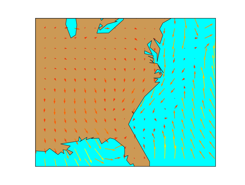
- The main problem when using quiver is that the point density may be too high, and the method can’t skip points by itself.
To do it, a matrix taking only 1/4 th of the elements is created
The matrix points has the element positions to take
The arguments passed to barbs are selected using the points matrix, so taking only one of every 4 elements
u and v are supposed to be in the map coordinates, not north-south or west-east. If they were in geographical coordinates, rotate_vector could be used to rotate them properly
The wind speed is calculated to pass the color values to the quiver method. The length of the array must be the same as in x, y, u & v, of course
scatter
Plot multiple markers on the map
scatter(x, y, *args, **kwargs)
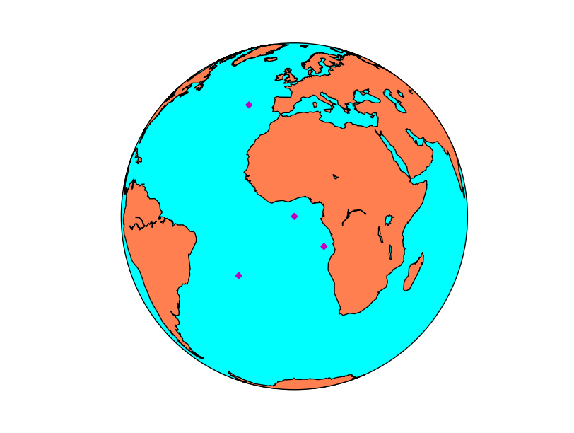
x and y is a list of points to add to the map as markers
If latlon keyword is set to True, x,y are interpreted as longitude and latitude in degrees. Won’t work in old basemap versions
By default, the marker is a point. This page explains all the options
By default, the color is black (k). This page explains all the color options
from mpl_toolkits.basemap import Basemap
import matplotlib.pyplot as plt

map = Basemap(projection='ortho',
              lat_0=0, lon_0=0)

map.drawmapboundary(fill_color='aqua')
map.fillcontinents(color='coral',lake_color='aqua')
map.drawcoastlines()

lons = [0, 10, -20, -20]
lats = [0, -10, 40, -20]

x, y = map(lons, lats)

map.scatter(x, y, marker='D',color='m')

plt.show()
streamplot
Plots streamlines from a vectorial field.
streamplot(x, y, u, v, *args, **kwargs)
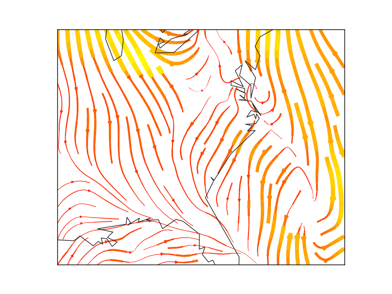
- x and y are matrices of the same size as u and v data, containing the positions of the elements in the map coordinates.
As the docs explain, x and y must be evenly spaced. This mean that when the original values come from a different projection, the data matrix must be re-projected, and the x and y matrices re-calculated, as you can see in the example.
To calculate an evenly spaced grid, the method makegrid can be used. It’s better to use the returnxy=True attribute to get the grid in the map projection units.
- u and v are the left-right and up-down magnitudes
Note that they are NOT in north-south ans west-east. If the input projection has non-cylindrical projections (those other than cyl, merc, cyl, gall and mill), the u and v should be rotated, using rotate_vector or transform_scalar methods
The dimensions must be the same as x and y
- color can set the same color for the streamlines, or change depending of the data:
If the value is a scalar, all the streamlines will have the indicated color, depending on the colormap
If the value is an array of the same size as data (the module of the wind in the example), the color will change according to it, using the color map
cmap sets the color map
- linewidth sets the width of the streamlines in a similar way as the color
If is a scalar, all the streamlines have the indicated width
If is an array, the streamline width will change according to the values of the array
density sets the closeness of streamlines to plot. a 1 value means the domains is divided in 30x30, with only one streamline crossing each sector. If a list with two elements is passed, the x and y densities are set to different values
norm Normalizes the scale to set luminance data
arrowsize scales the arrow size
arrowstyle stes the arrow style. The docs are at FancyArrowPatch
minlength sets the minimum length of the streamline in the map coordinates
The best documentation for the function is not the one in Basemap, but in matplotlib
from mpl_toolkits.basemap import Basemap
import matplotlib.pyplot as plt
from osgeo import gdal
import numpy


map = Basemap(llcrnrlon=-93.7, llcrnrlat=28., urcrnrlon=-66.1, urcrnrlat=39.5,
              projection='lcc', lat_1=30., lat_2=60., lat_0=34.83158, lon_0=-98.)

ds = gdal.Open("../sample_files/wrf.tiff")
lons = ds.GetRasterBand(4).ReadAsArray()
lats = ds.GetRasterBand(5).ReadAsArray()
u10 = ds.GetRasterBand(1).ReadAsArray()
v10 = ds.GetRasterBand(2).ReadAsArray()
speed = numpy.sqrt(u10*u10 + v10*v10)
xx, yy = map.makegrid(v10.shape[1], v10.shape[0], returnxy=True)[2:4]

map.streamplot(xx, yy, u10, v10, color=speed, cmap=plt.cm.autumn, linewidth=0.5*speed)

map.drawcoastlines(color = '0.15')

plt.show()
Note
The matplotlib and basemap versions must be quite new to use this function. From Ubuntu 14.04, for instance you need to use sudo pip install –upgrade matplotlib. Do then the same with Basemap
text
Plots a text on the map
text(x, y, s, fontdict=None, withdash=False, **kwargs)
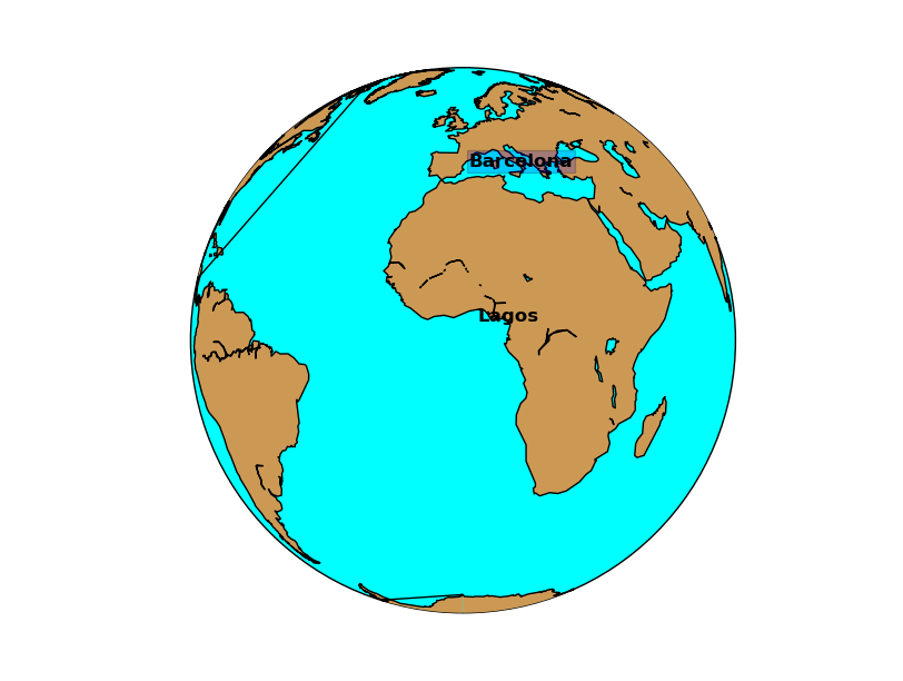
The text method does not belong to Basemap, but directly to matplotlib, so it must be called from the plot or axis instance
x and y are the coordinates in the map projection. Arrays of coordinates are not accepted, so to add multiple labels, call the method multiple times
s is the text string
withdash creates a text with a dash when set to true
fontdict can be used to group the text properties
The text can have many many options such as:
fontsize the font size
fontweight font weight, such as bold
ha horitzontal align, like center, left or right
va vertical align, like center, top or bottom
color the color. This page explains all the color options
bbox creates a box around the text: bbox=dict(facecolor=”red”, alpha=0.5)
from mpl_toolkits.basemap import Basemap
import matplotlib.pyplot as plt

map = Basemap(projection='ortho',
              lat_0=0, lon_0=0)

map.drawmapboundary(fill_color='aqua')
map.fillcontinents(color='#cc9955',lake_color='aqua')
map.drawcoastlines()

lon = 3.4
lat = 3.4

x, y = map(lon, lat)

plt.text(x, y, 'Lagos',fontsize=12,fontweight='bold',
                    ha='left',va='bottom',color='k')

lon = 2.1
lat = 41.

x, y = map(lon, lat)

plt.text(x, y, 'Barcelona',fontsize=12,fontweight='bold',
                    ha='left',va='center',color='k',
                    bbox=dict(facecolor='b', alpha=0.2))
plt.show()
To draw a text label with an arrow, use annotate.